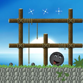
Turned out collision handling was a bit more difficult than I thought. It didn’t came as a big surprize, as it’s not one of the easiest subjects anyway, but after I had finished the boolean collision checks (it collides, or it doesn’t), I started to think the rest wouldn’t be too hard anymore either.
My current approach is to look for the smallest intersection after moving an object, so to correct it’s movement. No problem with that, it’s just another few hundred lines of code. Then comes a problem: what if the corrected movement would cause the shape to intersect another object? No big deal, just check all other relevant shapes. But what if, after a few corrections, it would intersect one of the earlier shapes? That’s an issue I still don’t have an answer to.
Another issue is movement constraints. Certain shapes need to be constrainted to move only on a certain axis. Correcting movement becomes quite more difficult there – or at least, I haven’t found a way to correctly handle it yet. Currently I think doing multiple tests, at various points across the movement vector, might just suffice… hopefully.
Well, lot’s of stuff to test there. I hope I can get some substantial progress the coming time, as my internship takes quite some time and energy as well. It’s fun, though, and again encourages me to program in C++ at home. “Build once, debug everywhere” is the new latest motto at my job, and while I’m getting used to the don’t-worry-about-the-low-level approach, I still miss it at points. Sometimes it’s downright frustrating. Oh well, that’s probably the case with everything, so I’ll live with it. :)